Latest updates for Dataviz

Fresh curated links around dataviz are collected here so marketers can spot useful updates and turn timely ideas into posts faster.

Recent items include:

  • Data Visualization Examples That Make Data Speak — DataViz Weekly
  • New Data Visuals That Surface What Matters — DataViz Weekly
  • вњљ Visualization tools, resources, and data, May 2026 roundup

Post angles to try

Share the most useful takeaway for your audience.
Turn one article into a quick practical checklist.
Ask your audience how this shift affects their work.
Turn angles into scheduled posts

Fresh articles and ideas

Recent curated links from global sources. Generate one free draft from any story, then use SocialBu to schedule and refine your content calendar.

anychart.com /1 week ago

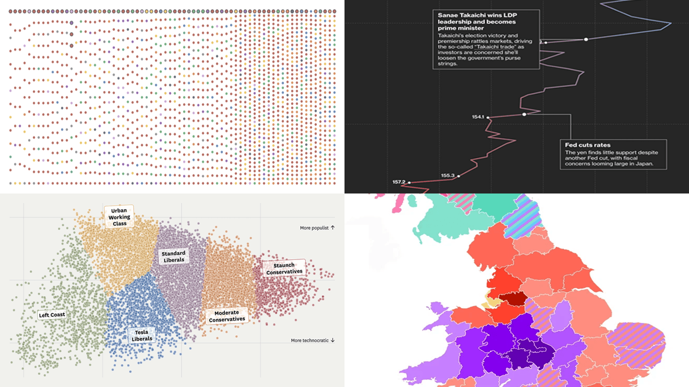
Data Visualization Examples That Make Data Speak — DataViz Weekly

On its own, a table of numbers rarely tells you much. The right visualization gives that data a voice and lets the story inside it come through. This is what we look for when we pi...

Read source
anychart.com /3 weeks ago

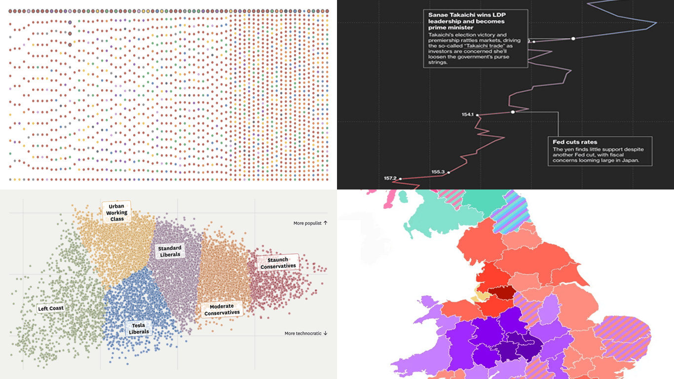
New Data Visuals That Surface What Matters — DataViz Weekly

A trend, pattern, or relationship can sit inside the numbers until the right chart or map draws it out. Good data visualization brings the important part forward, in a form people...

Read source
flowingdata.com /1 month ago

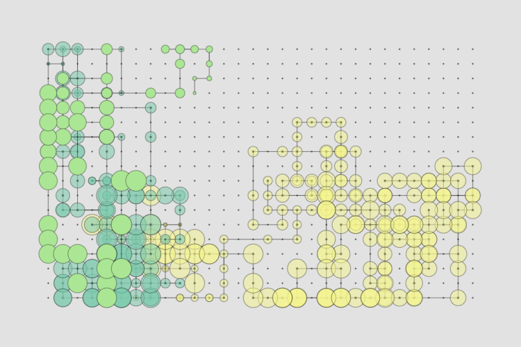
вњљ Visualization tools, resources, and data, May 2026 roundup

Every month I collect tools, data, and resources to make better charts. Here's what happened in May.Tags: roundup

Read source
anychart.com /1 month ago

Charts That Frame Numbers Clearly — DataViz Weekly

A good chart gives numbers a shape the eye can follow. DataViz Weekly is our regular roundup of data visualization projects from around the web that exemplify that power. Check out...

Read source
dev.to /1 month ago

A Scatter-Plot Explorer for World Statistics — Log Scales and Hand-Rolled Pearson Correlation

"Do countries with higher GDP per capita also have longer life expectancy?" I built a tool that lets you explore questions like that across 48 countries by picking any two of five...

Read source
anychart.com /5 days ago

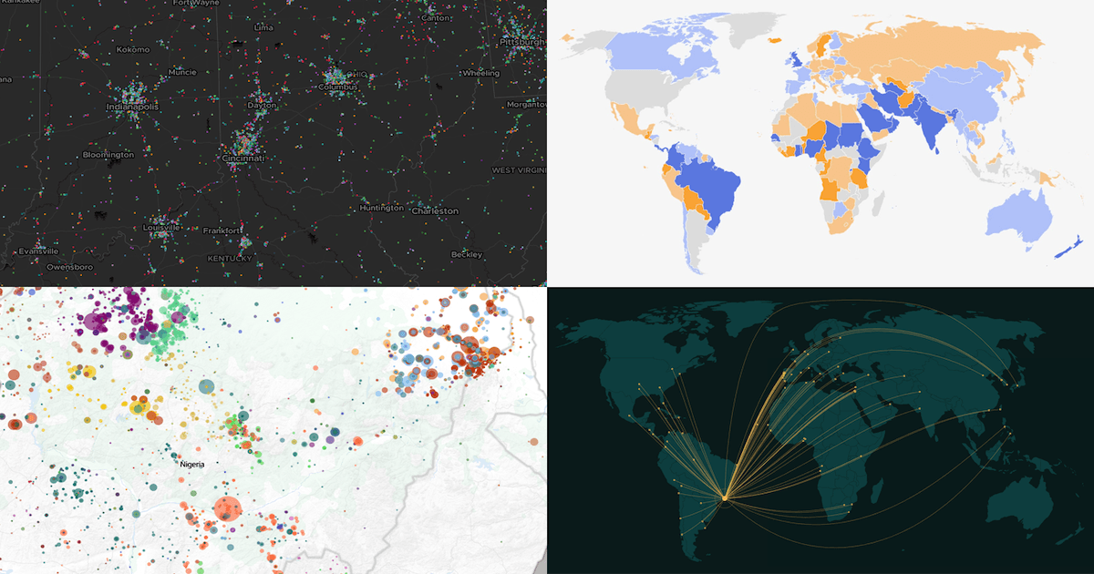
Recent Data Graphics That Pull Their Weight — DataViz Weekly

A strong data visualization does more than display figures. It carries a real share of the explaining, turning a dataset into something you can follow and question. Every Friday, D...

Read source
anychart.com /1 month ago

New Data Visualization Work Deserving a Closer Look — DataViz Weekly

Every week brings more charts, maps, and visual stories into view. In DataViz Weekly, we pick out recent data visualization work that feels worth a closer look, whether for the sub...

Read source
flowingdata.com /6 days ago

вњљ Wrong chart for the data

This week, a bar chart was the wrong choice.Tags: baseline, tool

Read source
habr.com /3 days ago

7 шагов, 6 запретов и один валидатор: разбираю /dataviz в Claude Code

Скормил новому встроенному скиллу Claude Code датасет на 76 лет — только ранги, без чисел. Модель сама выбрала перевёрнутую лог-ось, проверила палитру математикой и починила наезжа...

Read source
anychart.com /1 month ago

Fresh Examples of Data Graphics Done Well — DataViz Weekly

A new edition of DataViz Weekly brings together four recent projects that stood out to us. They cover different subjects, formats, and storytelling approaches, but each shows how c...

Read source
flowingdata.com /1 month ago

вњљ Visualization is not the goal

This week, we look past the chart and ponder its true purpose.Tags: analysis, template

Read source
anychart.com /2 weeks ago

Visualizing Data on AI and Climate — DataViz Weekly

Over the course of a week, we look through a wide range of data visualization projects. On Friday, the four that stood out most to us make it into DataViz Weekly, to inspire your o...

Read source
journalism.co.uk /1 month ago

The one question The Times is answering through data

A new data team uses simple charts and colour-coded trends across 40 indicators to help readers make sense of the numbers

Read source
flowingdata.com /2 weeks ago

✚ Visualization tools, resources, and datasets — June 2026 roundup

This is what happened in June.Tags: roundup

Read source
flowingdata.com /1 month ago

вњљ Showing when the data flips

This week, we focus on when there is a sudden change or flip in the data that you want to highlight.Tags: difference, highlight

Read source
uxdesign.cc /1 month ago

Your design taste isn’t a feeling. It’s a prediction about user behavior.

What DataViz taught me about the importance of explaining designContinue reading on UX Collective »

Read source
habr.com /1 month ago

15 приёмов EDA на Python, которые работают лучше красивого дизайна

Каждый раз, когда вы делаете EDA, вы стоите перед выбором: нарисовать быстрый df.plot() - или потратить 10-20 минут на оформление, которое скажет что-то важное про ваши данные. В н...

Read source
flowingdata.com /1 month ago

вњљ Weakness of a bar chart

This week, we talk limitations of the defaultiest of defaultiest chart types.Tags: options, precision, variation

Read source
anychart.com /1 month ago

Interesting Data Maps From Around the Web — DataViz Weekly

We have come across several interesting data maps over the past few days, so this edition of DataViz Weekly leans spatial. The four projects we selected show how maps can make loca...

Read source
flowingdata.com /1 week ago

вњљ Automated data to charts to insights

This week, a framework of AI agents enter the game to automate all the steps of data to charts to insight. We're not cooked, yet.Tags: agent, automation

Read source
news.mit.edu /1 month ago

MIT researchers teach AI models to interpret charts

The new ChartNet training dataset could improve the accuracy of vision-language models that help analyze business trends or interpret scientific figures.

Read source
syncfusion.com /1 month ago

Bring Excel-Style Data Analysis Directly Into Your React Apps

Build Excel‑style data analysis directly in React using spreadsheet formulas to power dashboards, reports, and apps with real‑time recalculation and clean UX!

Read source
dataengineeringcentral.substack.com /1 month ago

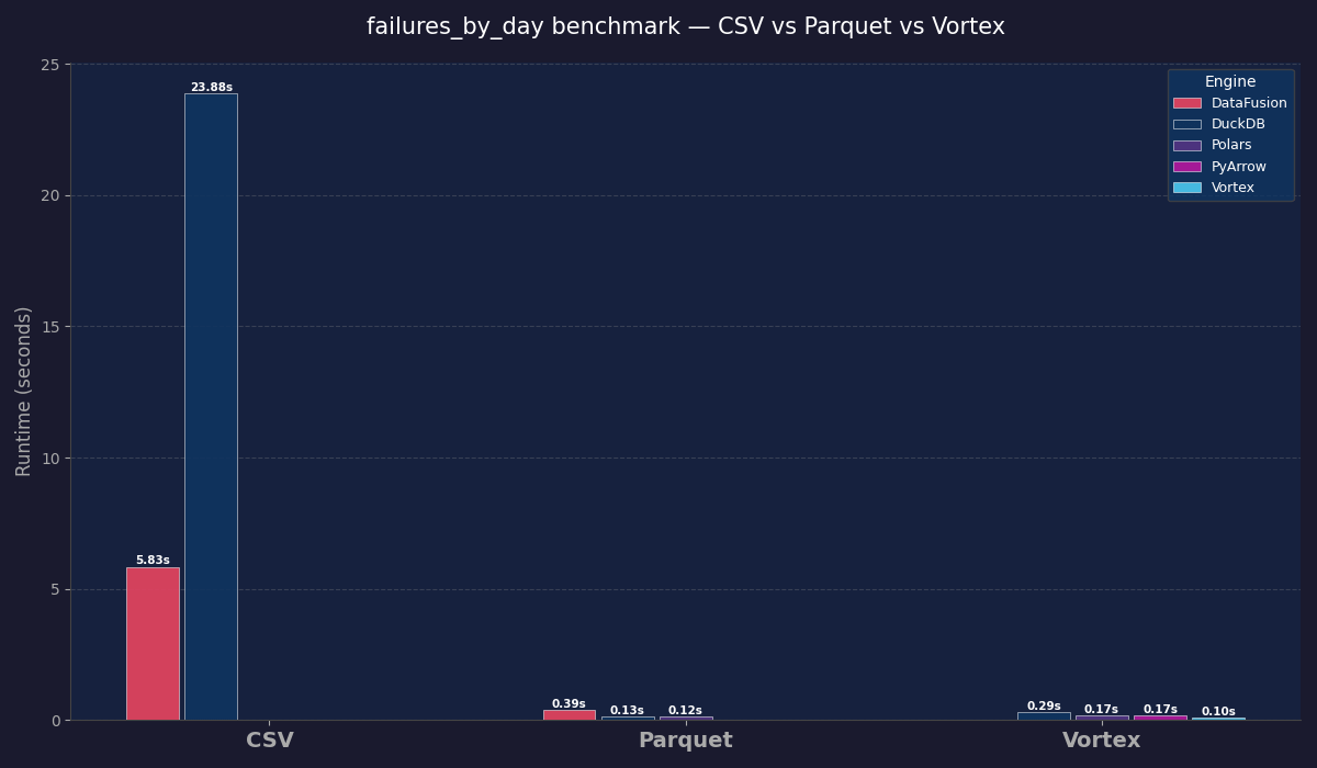
Benchmarking Vortex File Format ... vs Parquet, CSV ... vs DuckDB, Polars, Datafusion.

just because we want to make em' mad

Read source
evolvingweb.com /1 month ago

Evolving Web: Bringing climate data to life through data exploration

Climate data are shaping decisions everywhere, from infrastructure and public health to agriculture, insurance, emergency preparedness, and urban planning. Yet despite the growing...

Read source

Turn fresh research into a full content calendar

Use SocialBu to discover ideas, generate post drafts, and schedule them across your social channels.

Sources covering Dataviz

dataengineeringcentral.substack.com

Recent coverage from public sources
Public source

dev.to

Recent coverage from public sources
Public source

flowingdata.com

Recent coverage from public sources
Public source

habr.com

Recent coverage from public sources
Public source

news.mit.edu

Recent coverage from public sources
Public source

uxdesign.cc

Recent coverage from public sources
Public source