Latest updates for Charts

Fresh curated links around Charts are collected here so marketers can spot useful updates and turn timely ideas into posts faster.

Recent items include:

  • Demo - Chart Copilot
  • Professional-Looking Charts For Really Stupid Things
  • Chart synchronizer

Post angles to try

Share the most useful takeaway for your audience.
Turn one article into a quick practical checklist.
Ask your audience how this shift affects their work.
Turn angles into scheduled posts

Fresh articles and ideas

Recent curated links from global sources. Generate one free draft from any story, then use SocialBu to schedule and refine your content calendar.

mql5.com /1 week ago

Demo - Chart Copilot

Read source
thechive.com /1 week ago

Professional-Looking Charts For Really Stupid Things

Read source
mql5.com /1 month ago

Chart synchronizer

Read source
flowingdata.com /6 days ago

вњљ Wrong chart for the data

This week, a bar chart was the wrong choice.Tags: baseline, tool

Read source
anychart.com /1 month ago

Charts That Frame Numbers Clearly — DataViz Weekly

A good chart gives numbers a shape the eye can follow. DataViz Weekly is our regular roundup of data visualization projects from around the web that exemplify that power. Check out...

Read source
syncfusion.com /5 days ago

Still Building Custom Chart Builders? Build Runtime Charts with Blazor Chart Wizard

Create runtime-configurable charts in Blazor using Chart Wizard. Enable field mapping, layout persistence, and export features with minimal code.

Read source
mql5.com /1 month ago

CHART PATTERNS

Read source
thechive.com /1 month ago

Cheeky Graphs That Perfectly Explain It All

Read source
seekingalpha.com /2 weeks ago

Interesting Chart Updates

Read source
anychart.com /1 week ago

Data Visualization Examples That Make Data Speak — DataViz Weekly

On its own, a table of numbers rarely tells you much. The right visualization gives that data a voice and lets the story inside it come through. This is what we look for when we pi...

Read source
beforesandafters.com /1 week ago

Balls and Charts

A video tribute to VFX artists, especially the on-set data wrangling teams. The post Balls and Charts appeared first on befores & afters.

Read source
dev.to /1 month ago

A Scatter-Plot Explorer for World Statistics — Log Scales and Hand-Rolled Pearson Correlation

"Do countries with higher GDP per capita also have longer life expectancy?" I built a tool that lets you explore questions like that across 48 countries by picking any two of five...

Read source
soompi.com /1 day ago

Circle Chart Reveals Midyear Album And Digital Charts For 1st Half Of 2026

Circle Chart (formerly known as Gaon Chart) has published its midyear charts for the first half of 2026! As the midyear chart results are based on accumulated weekly data since the...

Read source
flowingdata.com /1 month ago

вњљ Weakness of a bar chart

This week, we talk limitations of the defaultiest of defaultiest chart types.Tags: options, precision, variation

Read source
css-tricks.com /1 month ago

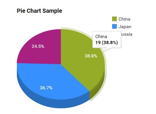
Another Stab at the Perfect CSS Pie Chart… Sans JavaScript!

We dive again into CSS Pie Charts! This time, Author Antoine Villepreux delivers semantic and flexible charts without a single line of JS. Another Stab at the Perfect CSS Pie Char...

Read source

Turn fresh research into a full content calendar

Use SocialBu to discover ideas, generate post drafts, and schedule them across your social channels.

Sources covering Charts

beforesandafters.com

Recent coverage from public sources
Public source

css-tricks.com

Recent coverage from public sources
Public source

dev.to

Recent coverage from public sources
Public source

flowingdata.com

Recent coverage from public sources
Public source

seekingalpha.com

Recent coverage from public sources
Public source

thechive.com

Recent coverage from public sources
Public source