Let’s be honest, social media is a scroll fest. If your post doesn’t look exciting, it’s getting ignored. That’s why smart social media design ideas are a total game-changer. With the right mix of graphic design, colors, and layout, you can stop thumbs in their tracks and turn views into likes, shares, and comments.
People love content that’s easy to look at and fun to engage with. That’s where visual storytelling, aesthetic layouts, and a sprinkle of interactive content design come in. These tools make your posts not just pretty, but powerful.
In this blog, you’ll discover 10 super creative (and easy) social media design ideas that anyone can use. We’ve got you covered with engaging design tips for social posts, design templates for social media content, and loads of inspo to help you create social media visuals that boost engagement every time you hit “post.”
Let’s make your feed unskippable.
10 Creative Social Media Design Ideas That Drive Engagement
Want your posts to stop the scroll and get more likes, comments, and shares? These fun and easy social media design ideas will help you create content that pops, speaks, and gets noticed.
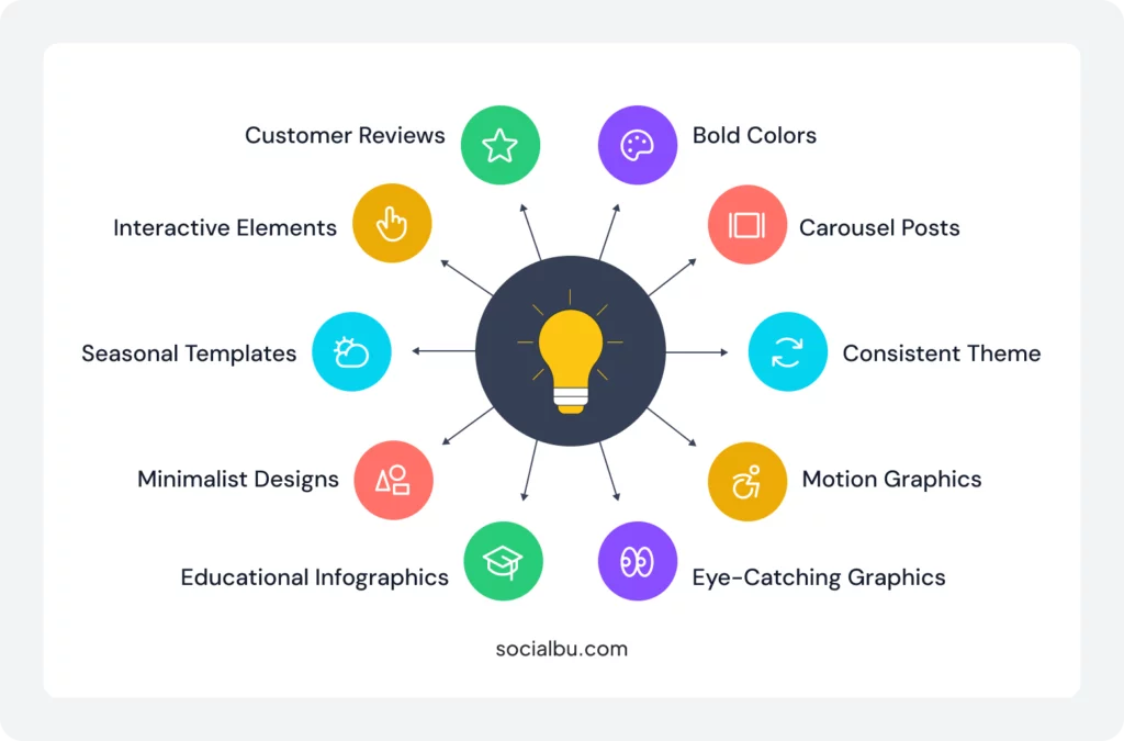
1. Use Bold Colors and Contrast
Bright, bold colors + high contrast = instant attention.
Bright, eye-popping colors help your post stand out. When people scroll through endless content, strong contrast and vibrant visuals grab attention quickly. A splash of color can make your post shine in a sea of boring scrolls.
Try these high-impact color palettes:
- Hot Pink + Jet Black + Neon Green
- Royal Blue + Bright Yellow + White
- Coral + Deep Navy + Sky Blue
- Orange + Purple + Mint Green
2. Add Motion with Short Animations or GIFs
A little movement goes a long way. Animations, GIFs, or simple video loops make your content feel alive and more clickable.
What You Can Do:
- Turn static text into bouncing or sliding text GIFs.
- Use apps like Canva or Adobe Express to animate icons, emojis, or your logo.
- Add a subtle video background (like waving grass or pulsing light) behind quotes.
3. Stick to a Consistent Brand Theme
Your audience should recognize your posts in seconds.
Create a design system with:
- 2-3 main brand colors
- 1 header font + 1 body font
- Consistent border or background style (e.g., always using a soft gradient)
- A watermark/logo placement rule (top-left or bottom-right)
4. Create Carousel Posts for Storytelling
Swipeable content is super engaging. Swipeable posts (aka carousels) are perfect for teaching, sharing tips, or telling stories. They encourage people to spend more time on your content, and that boosts engagement.
5. Turn Tips or Quotes into Eye-Catching Graphics
Take helpful tips, quotes, or fun facts and turn them into simple graphics with great design. It’s a quick way to add value and look good.
Example in action:
“Don’t post and ghost!”. In a speech bubble over a cartoon-style ghost with a smartphone. Brand color, backdrop, and bold sans-serif font complete the look.
6. Design Infographics That Educate Quickly
People love learning something new, fast. Infographics are perfect for breaking down complex info into bite-sized, visual content.
Use these layout ideas:
- 3-column design for “Do’s & Don’ts”
- Vertical list with numbered icons
- Before vs. After comparisons
7. Try Minimalist Designs with Clear Focus
Minimalist = memorable
Sometimes, less is more. A clean layout with one strong message can be more powerful than a busy post. Leave plenty of white space to help your message stand out.
8. Use Seasonal or Trend-Based Templates
Join the conversation with designs that match holidays, seasons, or viral trends. It keeps your brand fresh and in the moment. Pre-made templates make it fast and fun to stay on trend.
9. Incorporate Polls and Question Stickers
Want more interaction? Add polls, questions, or quizzes to your Stories or posts. They’re fun and great for engagement.
10. Highlight Customer Reviews with Stylish Graphics
Turn testimonials into beautiful, branded posts. When new followers see real customer love, they’re more likely to trust and engage with your brand.
Try this layout:
- Customer photo in a circle frame
- Bold quote in quotes or stylized typography
- Add star rating icons and product/service image
Ready to Put These Ideas into Action?
You don’t need to be a graphic designer to make content that pops. With the right tools and strategy, anyone can create visually engaging social media posts that drive real results.
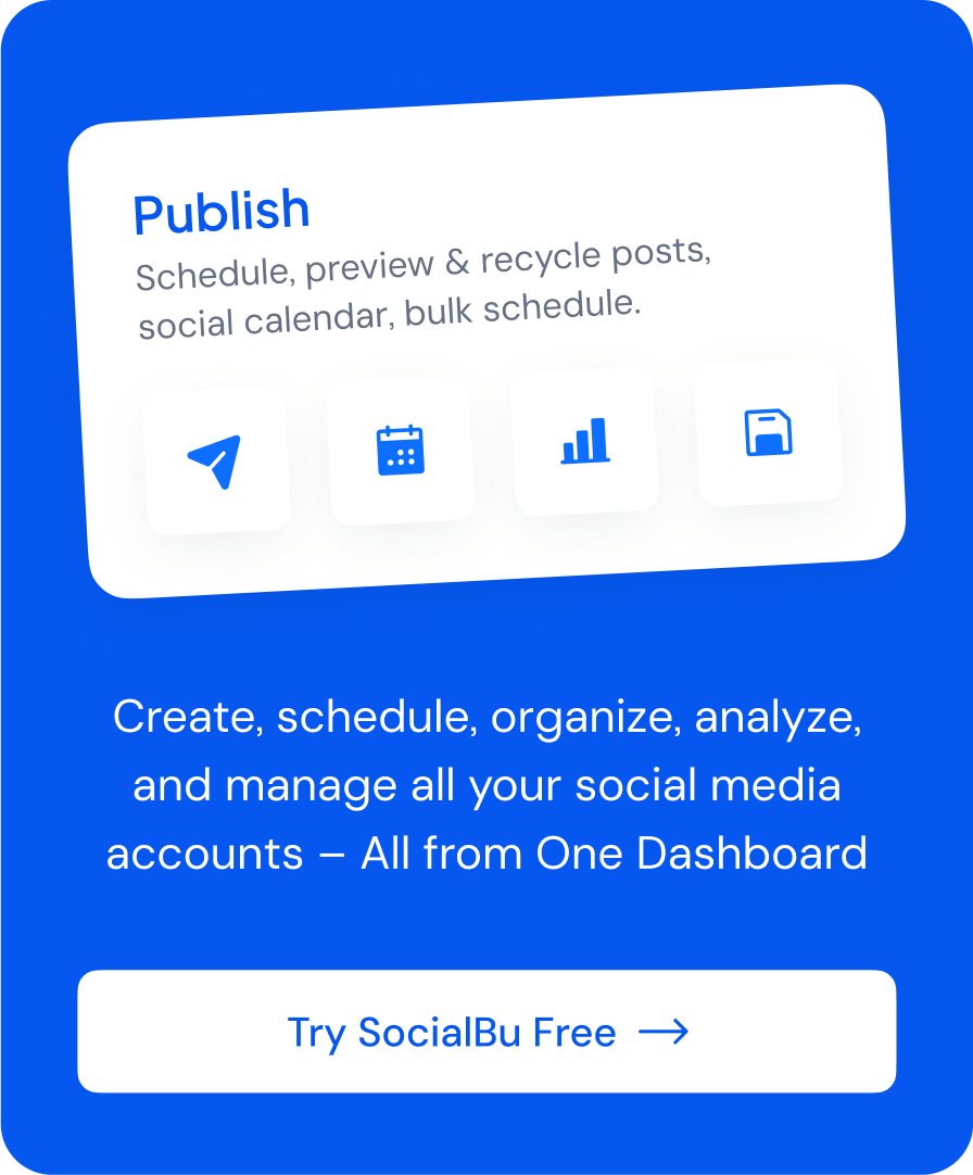
Looking for an all-in-one tool to schedule, manage, and plan your social content with ease?
Try SocialBu, it helps you organize posts, preview your visuals, stay consistent with your brand, and save tons of time.
Real-Life Inspiration: How Top Brands Nail Their Social Media Design
Looking for creative social media design ideas? Let’s break down how some real brands use engaging design tips to create social media visuals that truly boost engagement, and how you can do it too, even without a design team.
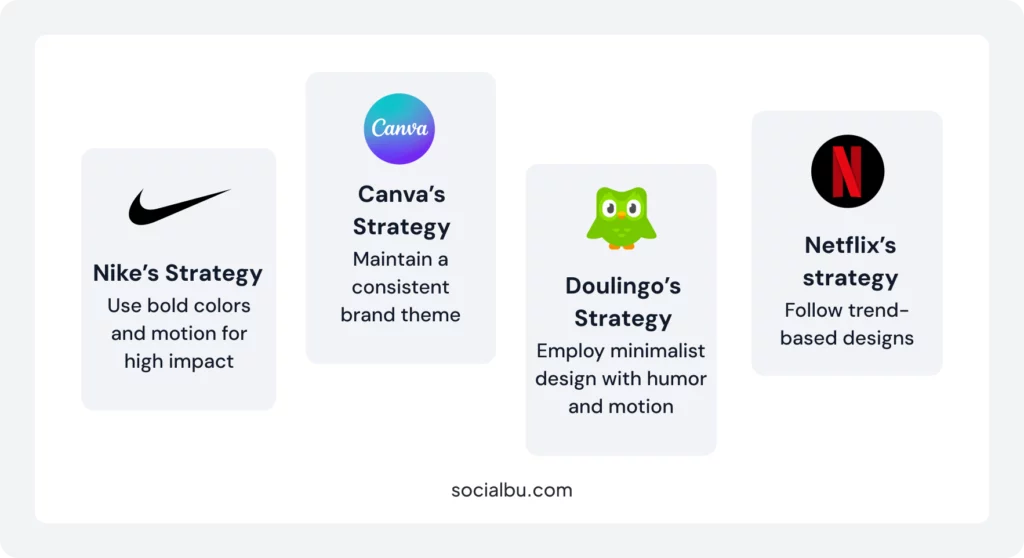
1. Nike – Bold Colors + Motion for High Impact
Nike uses bold, high-contrast colors paired with short animations in Stories and posts to instantly grab attention. Think of neon green against black or red overlays on videos. Their motion graphics highlight key products or messages in seconds.
2. Canva – Consistent Brand Theme
Canva’s posts are instantly recognizable. They stick to a specific color palette, use the same fonts, and follow a clean layout style. Whether it’s a tutorial or template promo, the design always feels “on-brand.”
3. Duolingo – Minimalist with Humor & Motion
Duolingo uses minimalist design with lots of white space and adds motion or character animation to create humor. Their owl mascot says it all with just a few words and a clever GIF.
4. Netflix – Trend-Based Designs
Netflix jumps on seasonal trends and pop culture moments fast. Their visuals reflect current events, making their content feel relevant and shareable.
Bonus: Infographics, Carousels & Polls Work Wonders
- Carousel Posts: Brands like HubSpot use carousels to share quick tips and tutorials in an easy-to-swipe format, perfect for visual storytelling.
- Infographics: National Geographic breaks down complex info into bite-sized visuals using icons and short text, a great way to educate quickly.
- Polls & Stickers: Sephora adds polls and quizzes to Stories with colorful backgrounds and fun visuals, boosting interactive content design.
Conclusion
If you want your posts to stand out in a busy feed, smart social media design ideas are your secret weapon. From bold colors to clean layouts and interactive content, the right design can stop the scroll and spark real engagement.
With these creative social media design ideas, you don’t need to be a professional designer. Just focus on graphic design basics, visual storytelling, and aesthetic layouts that match your brand. Use design templates for social media content to save time and create visually engaging social media posts that look polished and professional.
Remember, the goal is to make your content easy to look at, fun to interact with, and instantly recognizable.
Ready to create social media visuals that boost engagement?
Try tools like SocialBu to plan, schedule, and manage your posts, all in one place. With the right strategy and tools, your feed won’t just look good, it’ll perform even better.
Let’s make your feed unskippable, one post at a time.
FAQs
Q: What design styles get the most engagement?
Bold colors, clean layouts, and interactive content like polls or carousels tend to get the most likes, shares, and comments. Minimalist designs with one clear message also work really well.
Q: Should I use templates or custom designs?
Both work. Templates save time and keep things consistent. Custom designs are great for unique campaigns. Mix them up for the best results.
Q: Can motion graphics boost results?
Yes. Motion like GIFs, animations, or video loops grab attention and increase engagement. Even small movements make a big difference.
Q: How do I optimize design for each platform?
Use the right size and layout for each platform (square for Instagram, vertical for Stories, etc.). Keep mobile users in mind most people scroll on their phones.
Q: Are UGC visuals more engaging?
Absolutely. User-generated content (UGC) feels real and builds trust. People love seeing real reviews, photos, and experiences from other users.