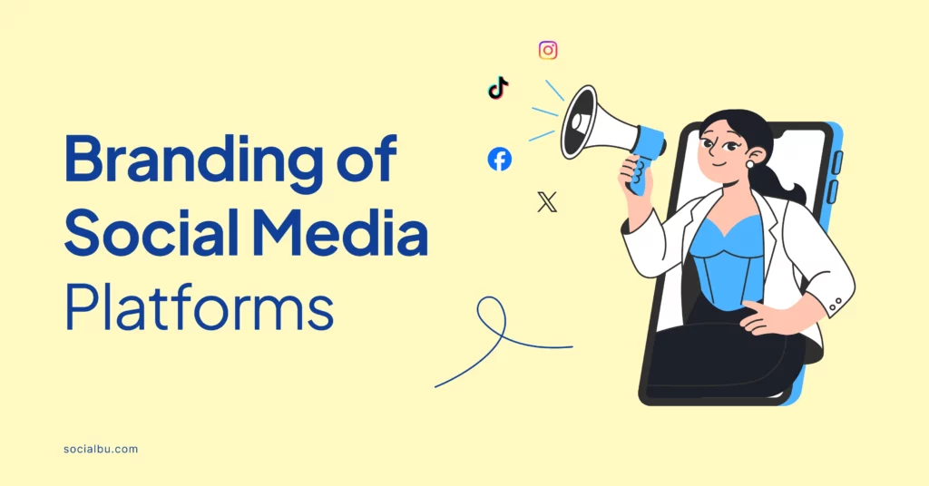
Social media platforms’ branding sets our time apart from other eras. It is now a part of everyone’s lives. Whether you use social media or not, what happens there affects the real world. Businesses are conducted there; even political campaigns often start there.
‘The social media world’ has become real, with its unique characteristics emphasized mainly by the hunger for user data and personal information for advertising purposes. Regardless, about 63.7% of people use social media.
It is so vital that some organizations have even made a business out of managing people’s social media presence for them.
The world has hundreds of social media platforms with unique logos. We see these logos daily but don’t always think about them. But these logos are essential. They make each platform stand out to its users.
More than that, users tend to get attached to a brand’s logo, such that changing that logo might upset them.
A lot of thought goes into creating social media logos. In this post, we’ll trace the thought processes behind some of the most powerful logos, journeying through social media’s visual language.
Nabo
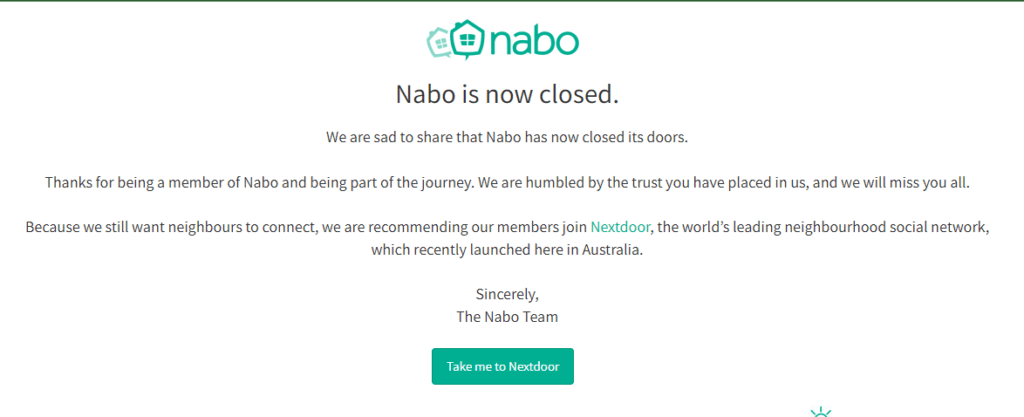
Nabo was a social network platform unique to Australia. It helped people in the same neighborhood to connect. Though it has now closed down, it gets an honorary mention as an example of a social media platform that is restricted to a place but still widely popular.
Before its shutdown, Nabo lived in over 6000 neighborhoods and had plans to be as big as Facebook.
Its logo was equally successful as some of the most famous Australian logos and is easily recognizable by many Australians. It features two homes sketched playfully side-by-side beside the platform’s name written in a playful, sans-serif font.
This highlights the platform’s neighborhood focus, and the warm shade of green suggests the coziness of a welcoming home.
Nabo’s logo suggests clarity of vision, which is essential in creating any brand.
Facebook is one of the most popular social media platforms. It is known worldwide. Even older people who don’t use social media much have Facebook accounts. The platform started as a college networking site, slowly expanding to become what it is today.
Facebook’s logo is one of the few that has not changed much over the years. There have been minor tweaks to the logo’s font; otherwise, it has remained the same since the beginning. Most users don’t even notice some of these changes.
The most striking feature of the logo is probably its color. This unique shade of blue was chosen because the company’s founder has a condition that makes blue the only color he can see easily.
This shade of blue has become so associated with Facebook that it is called ‘Facebook blue’ in the market. This teaches us the power of consistency in brand creation and shows us that the platform has always had a clear vision from its very beginning.
X
When discussing social media platforms’ branding, X’s logo has changed many times. The platform, formerly named Twitter, was renamed X when a new famous owner acquired it in 2022.
That year was also when the most recent change to the platform’s logo happened. The logo went from an image of a bluebird to a Unicode character ‘X.’
Some people believe that X’s numerous logo changes since its beginning suggest that the platform did not have a clear vision. That perhaps explains why it could not profit until twelve years after its launch.
Before the most recent and dramatic change to its logo, the bluebird had become synonymous with the platform, so many users were troubled to see it suddenly change. This made the platform even more unpopular than it had been before.
The important lesson here is that understanding your brand’s goal is essential before you create a brand identity.
Instagram is another widely popular social media platform whose logo has changed frequently. But unlike with X, it has not been a careless change. Instead, the logo changes as the platform evolves toward its goals. The platform’s sense of clarity has been very evident in the processes of change its logo has undergone.
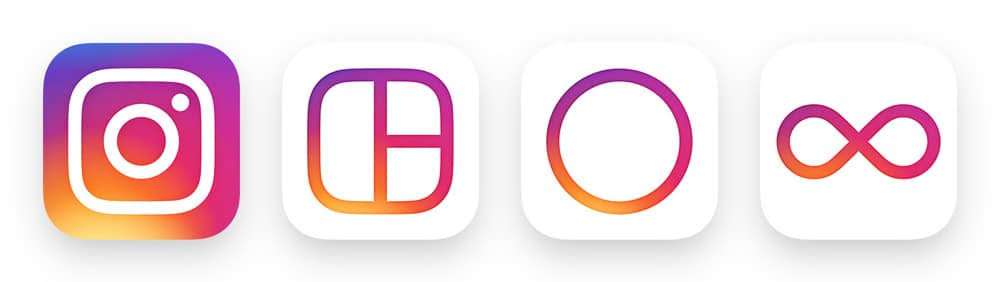
Following the platform’s launch in 2010, the first logo was a wordmark. The wordmark logo still exists in a different font from the first. However, its icon is more popular because the platform has always focused on smartphone operations.
The first icon was an image of an old-fashioned Polaroid camera designed by the CEO. Over the years, this image became increasingly simpler while maintaining its color and general impression.
However, a dramatic change in 2016 that introduced a minimalist version of the camera with different colors caused a great uproar among users.
However, this change was significant because the old logo, like all the ones before it, was skeuomorphic, a style in logo design that had gone out of fashion. The platform had to bring its users up to date with the times.
Final Thoughts
Although we always talk about popularity, social media platforms’ branding is usually central to their success. We love explaining tech evolution by the level of attachment internet users show to gadgets.
However, the tremendous achievements social media companies have recorded are not the results of their unlimited viral content alone.
As with any other company, social media giants also invest a lot of money and effort into their marketing strategy to reach as many people as possible, and visual representation is one key.