Let’s consider what people will look at when they first visit your Facebook profile or page. We know you’re going to say that it’s your profile picture, your bio, the CTA button, or maybe the banner. Yes, you’re right!
Your Facebook cover photo, with its vast space, is the first thing that will grab the audience’s attention foremost. That’s why it is essential to keep it visually appealing and eye-catching with a perfect color combo. But here is one thing: a perfect Facebook cover photo requires more than just stunning visuals.
To truly shine, it needs to fit perfectly within the Facebook-designated space.
So, to ensure that your cover photo stands out and doesn’t get cut off or cropped, you need to design it, keeping in mind the ideal Facebook cover photo size. But what is that ideal size ratio? This is what we’re going to reveal in this guide.
Keep reading to know what the perfect Facebook cover photo size is and the best cover photo practices in 2024 to design one that keeps hooking the audience and depicts your brand’s true story.
The Perfect Facebook Cover Photo Size
Your Facebook cover photo is like a digital billboard that quickly grabs visitors’ attention. It’s the first thing people see, setting the tone for your online presence.
But if you want to maintain the cover quality, you must stick to the right Facebook cover photo size. Otherwise, Facebook will stretch your uploaded cover wide, making the cover design blurry and pixelated. And if it’s too big, Facebook will crop and cut off the image to fit in.
So, what is the ideal Facebook cover photo size? The Facebook cover photo has two sizes depending on where you’re uploading and viewing it (mobile or desktop).
The golden ratio for your Facebook cover photo is a 16:9 aspect ratio. It ensures your image looks proportional on both desktop and mobile devices.
- The Facebook cover photo size is 820 pixels wide by 312 pixels tall for desktops.
- While on mobile devices, the Facebook cover photo size is 640 pixels wide by 360 pixels tall.
Tips for Best Facebook Cover Photo
- Keep the minimum size of up to 400 x 150 pixels.
- Keep your cover photo under 100 KB for quick loading times.
- Use PNG files over JPEGs for graphics and text for sharp visuals, as they offer superior quality.
- The dimensions for the Facebook Business Page are also the same.
- Keep the 16:9 aspect ratio for your Facebook cover photos.
- Position vital elements, logos, graphics, and text within the safe zone (center) to avoid unwanted cropping and ensure they’re always visible on both desktop and mobile.
How Facebook Cover Photos Appear on Mobile vs. Desktop Screens
As mentioned, Facebook cover photos are displayed differently on mobile and desktop. That’s why it is essential to design the main parts within the safe zone to display adequately on both devices.
So, that is the reason to know how Facebook cover photos appear on both mobile and desktop screens.
Facebook Cover Photo on Mobile
On mobile devices, your FB cover photo is cropped from the sides to fit the screen vertically. The sides of the image may not be apparent, so it’s crucial to place key content towards the center. Remember that the profile picture overlays a portion of the bottom of the cover photo on mobile, so avoid placing crucial details in that area.

Facebook Cover Photo on Desktop
On desktop screens, Facebook offers a broader canvas for cover photos. It showcases the width of your cover photo while cutting off the top and bottom of it. Ensure your cover photo is high resolution to maintain the quality on larger screens.

So, with all this analysis of Facebook cover photo displays on Mobile vs. Desktop, it’s recommended to use the Facebook cover photo size of 820 pixels wide × 360 pixels tall. However, place the designs and key materials towards the center of the image. This will ensure that they won’t get cropped from both devices.
Best Practices to Design a Perfect Facebook Cover Photo
Now you know the perfect Facebook cover photo size dimensions, but if you need help with ideas, keep reading.
Below, we’ve shared some best practices to remember while designing your Facebook cover photo.
1. Use Facebook Cover Photo Templates
We know it’s hard to design a cover photo from scratch. This is where prepared Facebook cover photo templates come in handy to remove the hard and guesswork. You can use these templates and customize the color, text, fonts, and key elements. It Sounds easy, right? So, you use the templates from HubSpot to simplify the creative process and craft an engaging Facebook cover photo effortlessly.
2. Ensure the Right Facebook Cover Photo Size
As mentioned earlier, the right size for a Facebook cover photo is 820 pixels wide × 312 pixels tall for computer screens and 640 pixels wide × 360 pixels tall for mobile screens.
If you upload a cover photo bigger than these dimensions, Facebook will cut it off, and if the image is smaller, it will stretch it to cover the banner space. This will make the photo look misinterpreted. And you don’t want your hours of hard work to get wasted and cropped at the end. So, ensure you design an image that is of the correct size ratio.
Moreover, stick to Facebook’s cover photo guidelines to prevent any issues and stay on the platform safely.
3. Right-Align the Objects
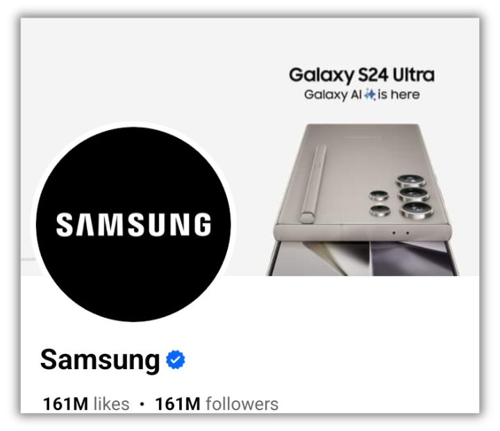
As you know, your profile picture displays on the left on Facebook and covers a portion of your banner; we recommend keeping the image focus right-aligned. It creates a balanced composition, enhances visual and aesthetic appeal, and maintains a clean look for your Facebook cover.
This alignment also provides balanced attention to the other things like your picture, logo, or any other element you used in the cover photo.
Have a look yourself!
4. Draw Attention to the Action Buttons
Facebook is a great platform to capture the audience’s attention. So take this chance with your cover photo and draw people’s attention to the primary CTA button.
Emphasize the action button under the bottom right side of your banner. You can add the CTA’s according to your business or services, like “Shop Now,” “Contact Us,” “Sign Up,” or “Send Message.” Directing users to take specific actions enhances user interaction and promotes conversions.
5. Keep it Mobile-Friendly
We all agree that smartphones are the most accessible and smart devices we carry with us all the time. That’s why 98.5 of Facebook users access it from their smartphones. So what does that mean?
It means keeping mobile users in mind and creating your Facebook cover photo accordingly. Facebook shows a smaller portion of the banner and cuts the edges, especially the right side, on mobile, so keep it mobile-friendly.
Let’s look at what a Facebook cover photo looks like on a desktop versus on a mobile.
Mobile View:

Desktop View:

Follow these techniques to create a perfect Facebook cover photo that reflects your brand’s narrative and encourages interaction.
Facebook Cover Photo Mistakes to Avoid
Though you’ve learned how to design a banner with the tips mentioned above, there are some areas you must focus on and avoid while designing one.
Here are some mistakes you must avoid while designing your own Facebook banner:
- Don’t Use Too Much Text: Avoid overcrowding your Facebook cover photo with excessive text when designing it. Though having text on the image is a great practice, too much can distract the viewers. Instead, you can opt for a visually appealing image with playful icons or a product display that conveys your message without using many words.
- Don’t Use Copyrighted Pictures: Ensure you use images you have the right to use. Always go with copyright-free or licensed photos for your Facebook cover. You can use free stock image websites like Pexels, Unsplash, or Freepik. You can even use Canva and its templates to create your Facebook cover photo.
- Don’t Use Unrelated Images: Don’t use an image for your Facebook cover just for the sake of using it. Instead, take advantage of this chance to showcase your brand and its identity. Use a cover photo that aligns with your content and displays your product or services. You can also include your brand logo and tagline or display your product or service to make a fresh and unique impression.
- Avoid Clutter: Simplicity always wins! So, choose it when designing your Facebook cover photo. Having an overcrowded cover photo will make it look like a mess and may confuse visitors. So, go with a clean, organized layout and add a few focal points because a clutter-free cover photo is more visually attractive and makes your message more accessible.
Wrap-Up
Your Facebook cover photo serves as the first impression of your profile. So, make it visually appealing and attractive to capture attention instantly. Stick to the recommended Facebook cover photo size and best practices to create a visual identity that reflects your brand personality and attention to detail.
Stay creative, stay current, and let your cover photo be the gateway to a welcoming digital presence in 2024 and beyond.
Try SocialBu to enhance your Facebook experience and grow your brand. With it, you can easily schedule your content, publish it on time, monitor hashtags, analyze performance, and collaborate!
FAQs:
What Size is the Cover Photo for Facebook 2024?
The ideal Facebook cover photo size in 2024 depends on where people see it! Using an 820 pixels wide by 312 pixels tall image on desktops is best. But on mobile devices, it is 640 pixels wide by 360 pixels tall. Aim for a broader image of 820 pixels wide by 360 pixels tall to be safe.
What is a Good Size for a Facebook Cover Photo?
The perfect size of a Facebook cover is 820 x 312 pixels on computers and 640 pixels wide and 360 pixels on mobile devices. So staying within the “safe zone” is recommended: an 820 px wide by 360 px tall area in the center. This will ensure that your Facebook cover photo’s crucial details are kept safe from being cut off no matter where your viewers see it (mobile or computer).
What is FB Cover Full Size?
The full size of a Facebook cover photo depends on whether you’re viewing it on a desktop or a mobile device. On desktops, it shows up at 820 pixels wide by 312 pixels tall. But on smartphones, it displays at 640 pixels wide by 360 pixels tall.
What is the Size of the Profile Picture on Facebook?
The Facebook profile picture appears in different sizes, depending on where you’re looking. On desktops, Facebook pictures display at 170 pixels × 170 pixels, but smartphones shrink it to 128 pixels × 128 pixels. Remember, Facebook crops your picture into a circle, so keep that in mind when choosing your photo!
